You can see light, but can you feel it? Sara McElroy of Silver Shoe Design says yes. Her philosophy of creating a tactile lighting experience by allowing shadow to support light is the kind of fresh thinking that got her named to Lighting magazine’s 2018 40under40 North America, which recognizes and celebrates a new generation of lighting design talent.
Sara recently gave us the details not only about her eye-catching project for makeup maven Glossier, but also her inspirations, focus, and how she gets people to that “a-ha” moment with light

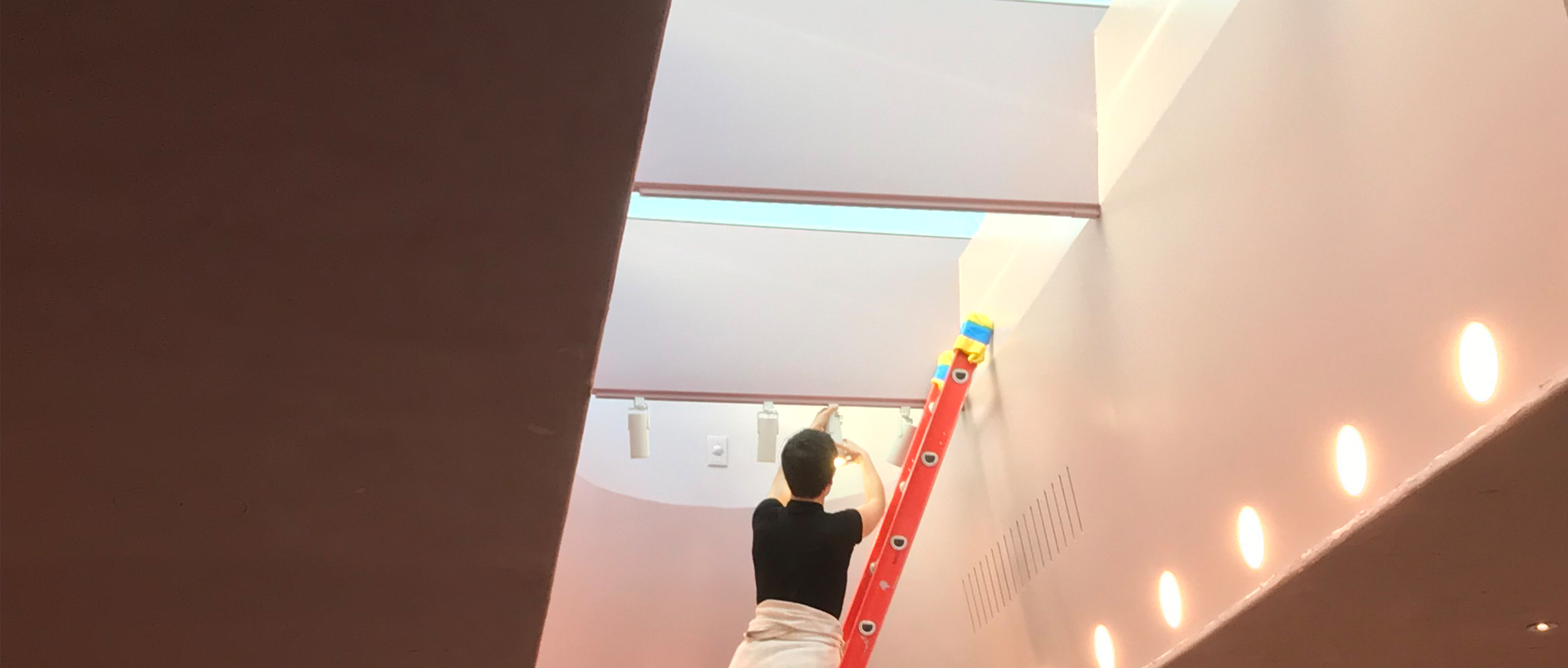
Sara McElroy installing Ketra lighting in a pop-up space for the skincare and beauty brand Glossier.
1. What inspired you to pursue a career in lighting design?
I was an idealistic philosophy major who wanted to change the world, maybe by going into law or being a professor. But, my senior year of college my father passed away of MS. He was a graphic designer and after watching his struggle, I came to see that design and the built environment can create a sense of wellbeing and actively improve a person’s experience. I ended up redefining my wide-eyed, grandiose goal from changing the world to changing someone’s world through their interior environment.
2. Take us through your journey from starting your career to making the leap to start your own firm.
When I joined Suzan Tillotson’s firm in New York, I was energized to work with a team of badass women and worked there for 4.5 years, but at that point, I started feeling pulled towards smaller projects, where I would have more of a relationship with the people who would inhabit the space. So, it was perfect timing that after I wrapped up the Bloomberg News HQ with Tillotson, a friend asked me about working on a pop-up for Glossier— that’s when I started my own firm, Silver Shoe.
With Ketra I was able to create a temporal dynamic experience that wouldn't have been possible using other lights
3. Tell our readers about your work with Glossier.
Glossier sells online and direct-to-consumer and relies heavily on social media. So unlike more traditional retailers, when clients visit the space, they’re not interacting with the product or brand for the first time. Instead, they’re going for an experience or expanded knowledge. Glossier has such a strong brand that had to be reflected in the space— their brick and mortar presence needed to welcome clients and encourage them to stay as long as they like.

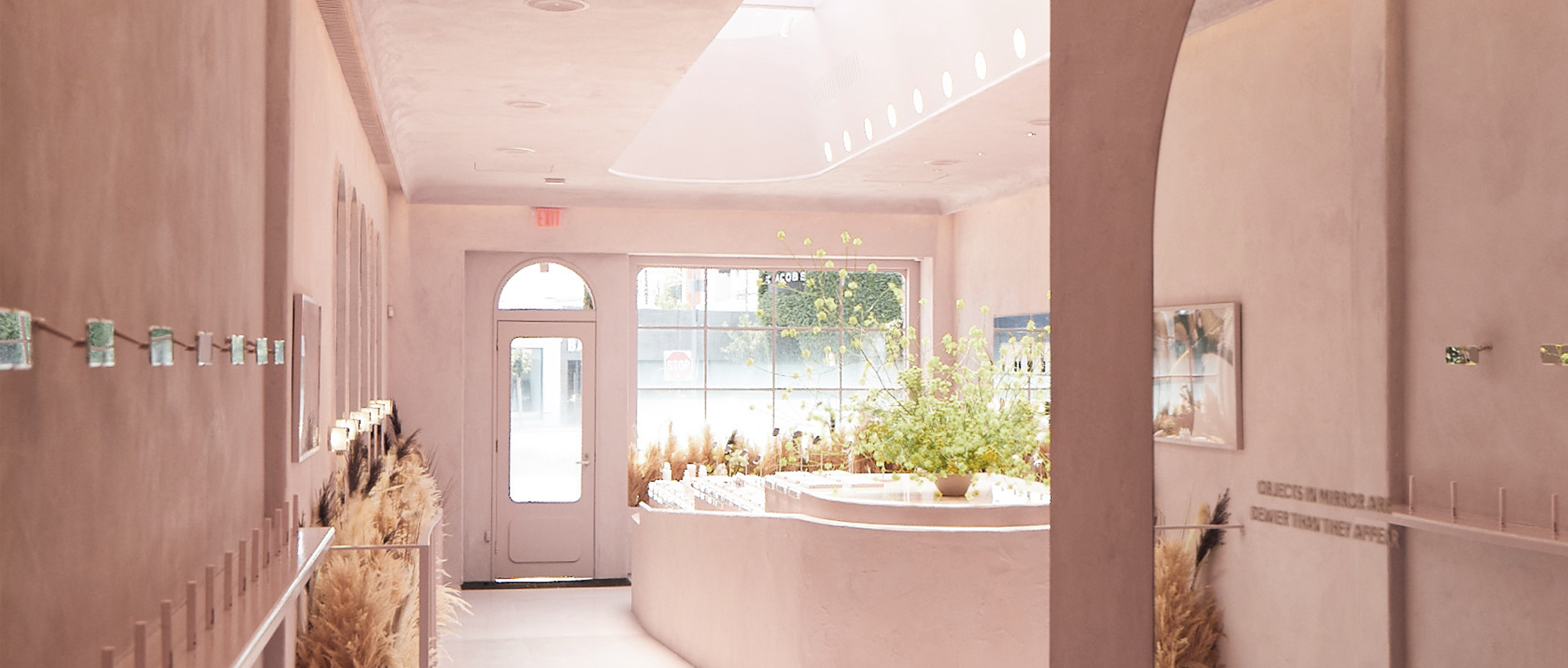
Glossier pop up Los Angeles store with lighting design by Sara McElroy.
In both NY and LA, the Glossier space was designed to feel like you’re walking into a residential space. The spaces also needed to be Instagram friendly without feeling overly theatrical. We started by creating an entrance experience in collaboration with the architect and the interior designer. As you come in off the street, the room is quite dim. But then, you start seeking the light, going up the stairs to the bright second floor. Creating that effect meant that we needed moments of lower light, but we also had to make sure these still supported the Instagram experience — phone cameras typically don't work well in low light.
4. Why did you choose Ketra for the Glossier project?
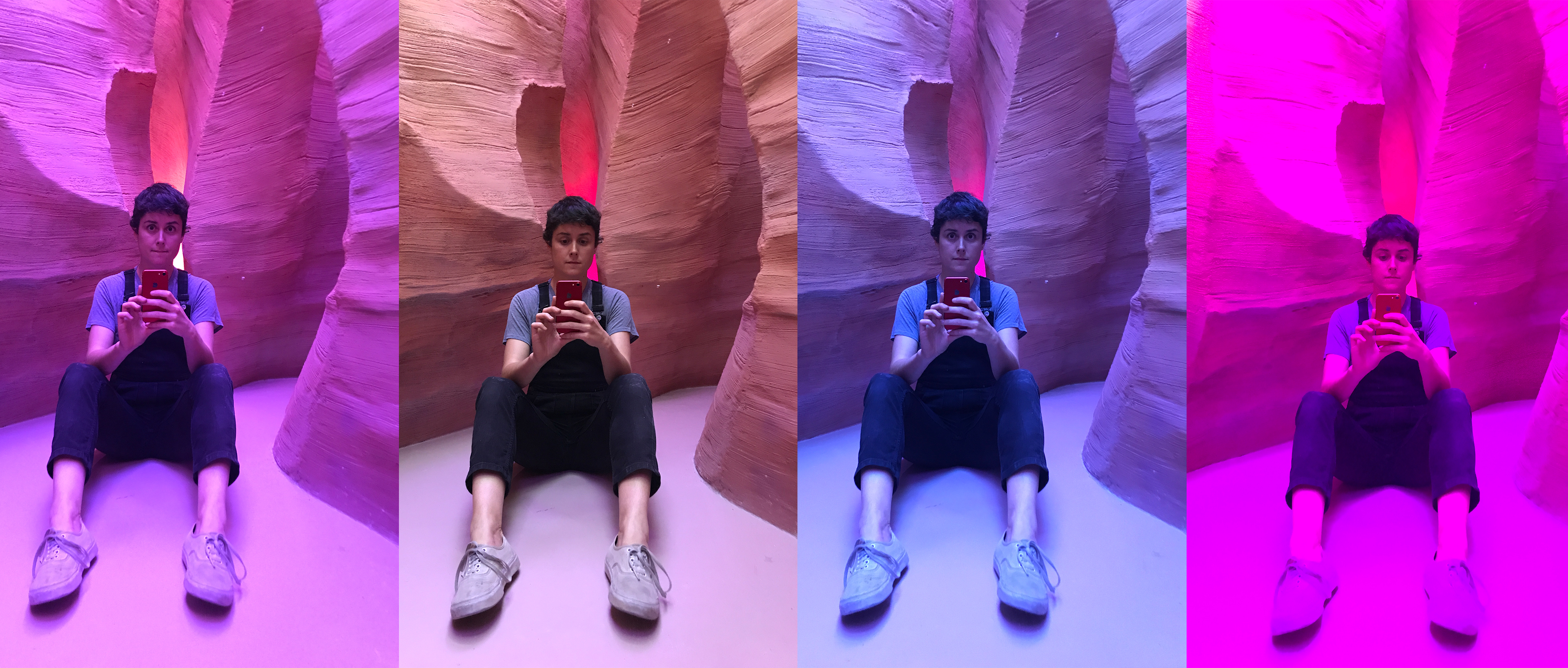
I wanted to transport visitors to another world. What takes the experience over the edge are the dynamic elements, like lighting and sound. In LA, Glossier had this idea to create a closet that was actually a canyon when you walked into it. You know, just a typical, run of the mill request! I created a multi-sensory experience that makes the viewer feel like they’re in Antelope Canyon in Arizona. It needed to feel like you were underground, but getting glimpses of sunlight and the sky. I also wanted the space to shift throughout the day like natural light would, transitioning from brighter light levels to darker, warmer ones. It was also a plus that Ketra is something I can program myself. With Ketra I was able to create a temporal dynamic experience that wouldn't have been possible using other lights. Being able to “set it and forget it” was also a huge help.

5. How do you get people to that "a-ha" moment with light?
Really, it’s the mockups along the way that help convince people. I prefer to come onto projects only if I can be present in the concept stage. When I work together with designers to collectively create the visual concept, it gives me a grounding to come back to — that’s key in a successful execution. On one project, I was really being pushed to chop some of the lighting budget and go with a lower end product. But, I brought in both the other choice and Ketra to show the client, and they instantly saw the difference and how much of an impact those extra dollars would have. It also helps that, for better or worse, I’m not really good at taking no for an answer.
6. Glossier is a completely new kind of retail space. What trends are you seeing in retail design and lighting?
Retail — especially direct-to-consumer brands — is really rethinking things. With increasingly high overheads, a space now has to be about more than just selling the product. Companies are looking for that extra oomph to create a buzz and drive customers to seek out that experience. On a pop-up with Japanese eyeliner brand Uzu I just finished, very little of the space was actually dedicated to product. The experience was really the focus, we had these color-changing light tubes and telephone booths where you could pick up the phones, which prompted an interactive experience. Then you could go to the back of the store to work with a consultant. Curating a unique and memorable experience for customers is definitely driving a lot of retail right now.
7. Speaking of trends, tell us a little about your teaching position at Parsons, shaping the next generation of lighting professionals.
I taught a class called Light, Perception, and Culture. Its goal was to help students rethink the way we understand light. Not only does light inform the way we see, but the reverse is also true —what we see informs how we perceive light. I also taught in the interior design department at Parsons, in the graduate studio, as well as an undergraduate studio for rising juniors.
8. Which lighting designers and artists inspire you and your work?
Obviously light artists: everyone’s going to tell you about the James Turrells of the world. It’s fun to talk about these well-known greats with students who haven't heard of them before, and introduce a new audience to their powerful work. But, it’s also fun to share some lesser known designers like Claudia Duston. She’s a lighting Ph.D. candidate in London, who’s doing some really interesting things with light. Robert Irwin is another big inspiration for me. We also read How the Built Environment Shapes Our Lives, by Sarah Williams. She talks a lot about the socio-economic aspect of design but also fuses it with the psychological aspect. I really try to help dissolve preconceived notions, so that lighting design becomes more inclusive. The class is really more theoretical than practical — but then again, I was a philosophy major, so I guess that makes sense.
To see more examples of Sara’s visionary work, visit her online at Silver Shoe Design. And if you enjoyed this post, we invite you to read our previous interviews with architect Erin Nies of Studio Llou, integrator Shannon Bush of ServiceTech, and lighting designer Erin Dreyfous of Tillotson Design Associates.
24/7 Technical Support:
1-844-LUTRON1 (588-7661)
lightingsupport@lutron.com
Customer Service:
Monday-Friday 8am- 5pm EST
1-844-LUTRON1 (588-7661)
The Ketra logo, Ketra, TruBeam, Color Lock, and Calibration360 are trademarks or registered trademarks of Lutron Electronics Co., Inc. in the US and/or other countries.
©2025 Lutron Electronics Co., Inc. All rights reserved.
Get inspired with all the best from Lutron and Ketra: exclusive news, project features, and more.